Make "Events" dev tools use screen space better#7449
Make "Events" dev tools use screen space better#7449spacegaier merged 8 commits intohome-assistant:devfrom
Conversation
|
I don't think the entity picker and service picker should be full width. Same for the event name. And we should probably set a max-width, and center it. Is it workable on a big, big screen? |
On big screens, it just grows. You want to center that? Do we have a common HA max width I should use to limit the growing? |
|
We have a max for Lovelace, should probably use that: |
|
Adding everything to a Ha-card 🤮 IMO cards aren't mean for everything |
They provide a good way to structure the screens / layouts. What would you propose we use instead? |
|
The page :) like other webpages do :) Im not totally against using them here. I just feel like HA trys to use Cards in too many places. I mean this is a bit different but checkout the homeassistant website home page... Somethings just aren't supposed to be in cards |
|
But other webpages still have clear visual structure, if not by using cards / blocks (background colors), then lines / borders to structure the view port. I am not hell-bent on using cards, but if I compare the before/after of the template tab, I think it is an improvement. And on purpose I did not move the template listeners information or on the event tab the available event list into ha-cards, since now the other elements around provide enough structure IMO. |
@bramkragten Are you sure there is a fixed max width for the content overall? I can see that each column has a max-width of 500px but I cannot see an overall restriction. The How do you propose we limit the size? Set a fixed limit at 1500px and leave its position as-is? |
|
Yes, set a fixed limit. I personally like it to be centered when it reached the max. Also, I think we should remove the card from the template dev tools and the service description. It really doesn't add anything and I don't think it looks better. |
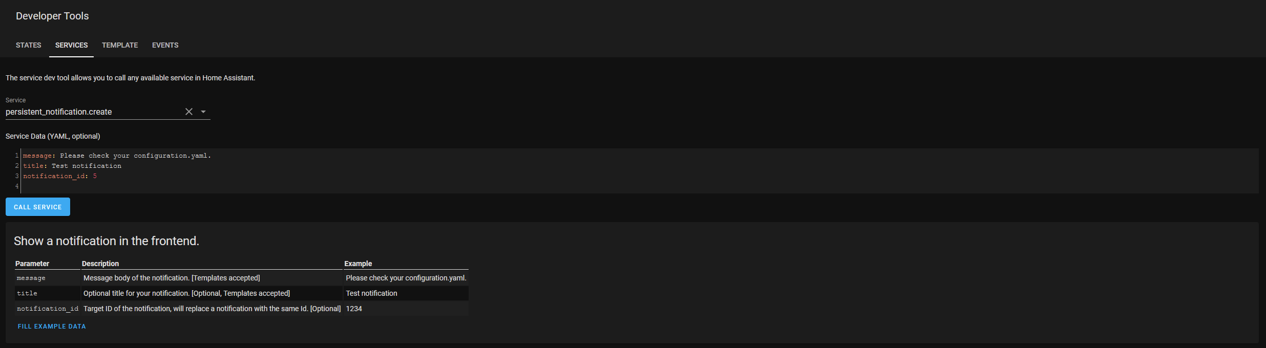
Any proposal for the max width I should set? I also quite strongly think that using cards here really helps with the visual appearance. Previously the template view just looked like a collection of "thrown" together elements. Now it's a much clearer two column look: Left side input, right side output. For the services: There is now a clear visual block that contains the details about the service and the related "Fill example data" button. The constant full-size width of the card also helps the page's consistency independent of how narrow the service parameter table itself is. So overall I feel quite strongly about those proposed changes 😄 . If it turns out I am the only one with that opinion, I could "probably 😉" also live with putting a full width horizontal line below the "Call service" button to at least have some sort of visual guidelines between input area on top and information area below. Update: The card for the "Services" is actually already in the dev branch through another PR (#7364). So that part is no longer up for this discussion 😆 . |
|
There hasn't been any activity on this pull request recently. This pull request has been automatically marked as stale because of that and will be closed if no further activity occurs within 7 days. |
|
Will tackle that soon, by splitting into smaller PRs so that the non controversial parts can be merged. |
|
fyi, I'm rewriting the service dev page soon 😄 |
|
Can we extract the events part of this PR in a separate PR? |
|
Yes, it is somewhere on my todo list :) |
 spacegaier
changed the title
spacegaier
changed the title
5 participants
Breaking change
Proposed change
Currently we wasting quite some screen space in the dev tools. This PR optimizes it
and makes the template tab a bit more structured by using.<ha-card>Events before:
Events after:
The following proposed changes have been reverted again:
Templates before:Templates after:Type of change
Example configuration
Additional information
Checklist
If user exposed functionality or configuration variables are added/changed: